When it comes to decorating, choosing the right paint colour can be a daunting exercise. It’s not quite as simple as picking your favourite hues and slapping paint onto walls haphazardly. Choosing colours involves many decisions. What is the room to be used for – relaxing or activities (different colours evoke different emotions), what is the relationship between each colour (colour is affected by the colour next to it), how much natural light comes in (light changes our perception of colour), and so on. Not only that, these days we’re confronted with literally thousands of paint colours from which to choose. Confusing, right? Actually, there are a few tricks to help make shopping for colour easier.
The first is to create a mood board or scrapbook that incorporates colour swatches, wallpaper samples and clippings from magazines.
“I always suggest people have a look through interior magazines and on the web to get some ideas together so they actually know where they are going,” says Resene colour consultant Sarah Gregory. “Then I suggest they come down to a Resene ColorShop and just stand in front of a colour palette in store. Generally people are drawn towards one colour group, like blues or greens or reds. Even if they don’t really know what they like, if they just spend some time looking they generally get pulled one way or the other.”
Show-off purples or racy reds may be your pick, but make sure test them first. The best way to determine how natural light will affect the colours you’ve chosen is to test them in the room they’re destined for.
“Artificial light can really throw something, especially with the neutrals because they’ve got so many undertones that sometimes they don’t show until the evening light hits them,” says Sarah. “Take some Resene testpots and try them out at home. But don’t paint them on the wall, paint them on a piece of card. That way you can move it around the room, because colour will look different where the light hits it.”
For example, the same paint used in two different rooms – one north-facing and one south-facing – may look completely different. In a north-facing room the light is brighter, so darker colours will appear brighter. In a south-facing room the light is less intense and darker hues may look even darker.
Likewise, the same colour painted on the walls in a large room may look different in a small room. In a small room the walls reflect onto one another so colours may appear more intense.
Flat, low-sheen, satin, semi-gloss and gloss finishes also play a role in how colour can change in certain lights. Glossy finishes are highly reflective and can lighten a room or add depth to colour; deep, dark colours with a gloss finish generally appear richer. Similarly, matt surfaces absorb the light and will appear darker and deeper than glossy reflective surfaces.
“Your lighting will also vary at different times of the day,” says Sarah. “Look at the colour in your room at various times of the day to make sure you still like the colour.”
When painting the Resene testpot onto the test card, Sarah suggests leaving a white border around the edge of it.
“That’s so that you don’t get total colour combination going on with the wall colour that’s already there. When you put colours together they change each other.”
“Colours can seem to change the more of them there is, so the bigger the sample the better idea you’ll get as to what it’s actually going to look when the whole room is painted.”
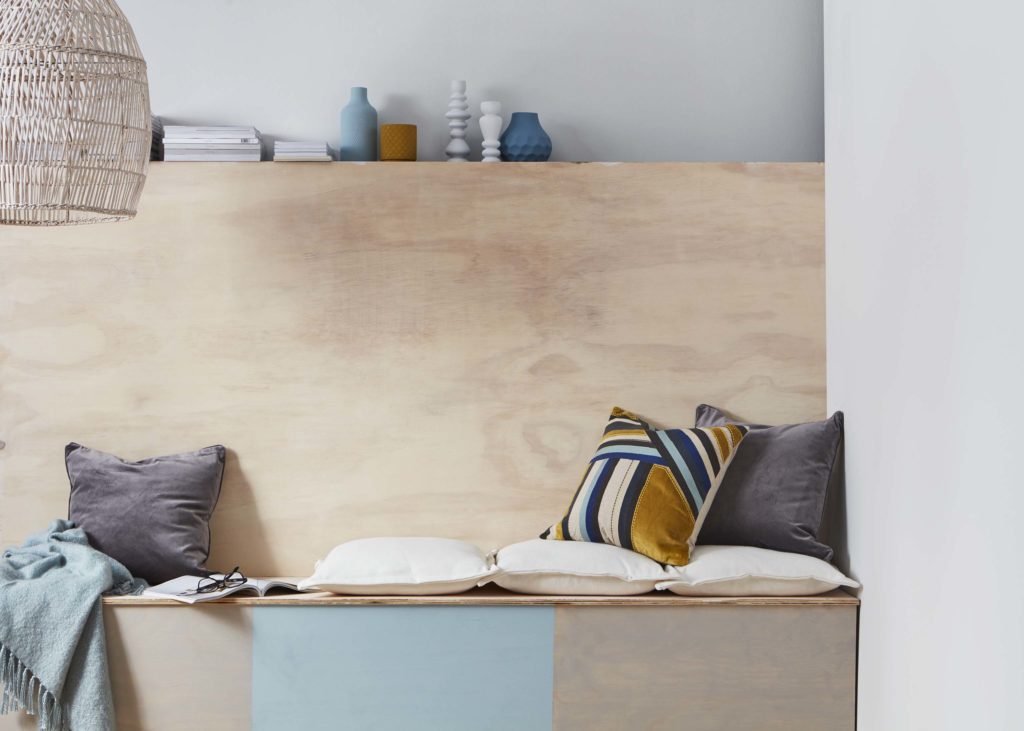
Left image: Wood-style lounge – wall to wall Resene Colorwood Whitewash and Resene Sea Fog with cabinetry in Resene Raindance and Resene Colorwood Whitewash.
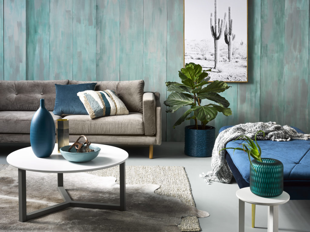
Right image: Green living room – wall to wall in Resene Inside Back and Resene Half Opal. The floor in Resene Half Gravel.
You might consider using one colour in different tones to create interest. For example, you could use a deeper blue such as Resene Cello as a feature colour alongside the lighter blue Resene Longitude. Or for a neutral palette, you could use Resene Thorndon Cream on the majority of your walls with a contrast such as Resene Triple Ash, which is from the neutral green palette.
Or for a complementary scheme, aim for a palette that consists of three colours: light, medium and dark. These three colours will form the foundation of your project.
“Typically light colours should be used on the ceiling, mid tones on the walls and a darker colour on the flooring,” says Sarah. “That all reverts back to feeling comfortable within nature; you’ve got the cloudy sky above you, the trees at eye level – your mid tone – and the forest floor at your feet. That’s a scheme that will make you feel comfortable if you’ve got those colours around you in those tones. You don’t necessarily have to do that, but it’s a really easy way of putting a scheme together that you will feel comfortable in.”
Get inspired by other kiwi living room decorating projects in the online inspiration gallery.
If you need help getting started, ask a Resene expert at your local Resene ColorShop
or online with the free Ask a Colour Expert service or free Ask a Tech Expert service.